


Community Conversations
Join groupIf you've just joined the WeddingWire community, this is the group for you. Here, you'll be able to introduce yourself to the rest of the brides and grooms, send us your doubts, share your experiences... and if you've been here for long enough, participate and help the beginners!
Members
Discussions
Hey, All You Lovely Ladies & Gorgeous Men! We are sure you guys are handling the Corona week with hard work and loads of sanitisers! We also know that many of you are faced with difficult...
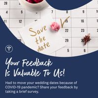
Hey, Y'all! How is your wedding planning going on? Are you a couple who had to postpone their upcoming wedding due to COVID? Has it been easy for you guys to maintain the thread of wedding planning...
Hey, you all lovelies! 💛 Memories are important to bring back and reminisce with your loved ones. But when it's with your mom? Remembrance become evergreen! 👩👦 From hopping to shopping malls to...
Hey Y'all! I hope this Mother's Day Week is vibing with you to the fullest! Remember your mother showering her magical talent which made your path of difficulty a cakewalk? Ever thought of imbibing...
Shopped from every possible brand, designer, store but still can't stop yourself from digging into your mom's closet ? HAHA don't worry because so can't we! We are in #LoveWithLegacy too. Tell us...
Hello team please suggest a wedding hashtag for Keshav and Tanisha ❤️🙏🏻
I don't know what I am going to do without my mom after marriage!! I mean, I don't even spend a single minute without her these days!!! And, spending a whole life without her makes me a bit...
What is a common type of mobile fitness app you can create?
Can any of you share any link of that show as to where we can see it, instead of Netflix?
Something that you both love to do together! We avoid being on screen and paint or cook something!
Which of the platform do you and your partner chat the most on?
But, i am not ready for the same. Like idk, why do parents have to do this, we are getting married on a good, note and that is more than good for us! I can't take this, what should I do?
Because this is the best thing we can do during this quarantine!!!
My dad cracked a joke about how if we are saving money, doing intimate wedding, we are also looking the money and gifts that relatives give😂
So, one of my knowns was getting married in April, but during the hit all the wedding vendors took a step back and now that the wedding can be hosted with 50 people? They have started preferring new...
Do you think such kind marriages have stepped ahead these days?
Hi team, Please provide some good wedding hashtags for Divesh and Vidhi.
Hey team please suggest me a hastags for instagram and wedding Groom name- chanchal / nikcname- suuBride name- heemanshu / nickname- chinu It was love at first sight We first meet in schoolWe love to...
Please suggest some good hashtag for Mohit and Mahek Thank you
Hi all, please help me find a wedding hashtag for Simran and Kirat.
Hi everyone! Please suggest a hashtag for Mayank and Shubhi. Looking forward for your lovely suggestions!Thanks
I’d really request your help. Thank you!
Just so you don't fall into the trap of depression or anything coz of not having a social life anymore!
HAhahhaa! For real!!
My mom literally made me climb and pull down all the house curtains over the weekend. It's that time of the year again.
Dreaming of a wedding that's as unique as you are? 😍 Look no further! Tap the Link below and dive into the top Wedding Trends for 2024 revealed by Wedding Experts that will help you create a...

something that you wouldn't have done otherwise!?
Hi guys, Kindly give wedding hashtag suggestions for Viraj and Shrutika...!! Thanks in advance.
Hey, Lovelies! 💙 New Week, New Question!! 😉 The question of the day is... Never Have I Ever Played Strip Poker With Anyone!
This is such a pure bliss, that I have literally started talking to my old friends and it feels so good talking to them. Pure bliss.
Its been quite a long time that we have spend time together. I’m planning to take him out this Saturday. Please help me with some nice suggestions
Groom Name - Ronak Bride Name - Nidhi Looking for a good hastag...😊